 |
| Colour of the Void |
by Gizmo_the_Bugbear
Self-Published
“for use with any level adventurer because they’re all doomed anyway”
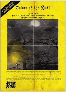
It is not fair. Mörk Borg modules are not noted for their high quality. Most barely rise above the level of crummy, and being “style over substance” is the least of their problems. I do not generally review them. Is it fair then to drag a random specimen into the limelight and savage it? No. I suppose not. But then random encounters are not fair. I bought Colour of the Void because it looked a cut above the norm – 24 pages seemed more substantial than usual, and something about the front cover looked promising. In fact, it is a lot like all the other Mörk Borg modules I have seen, with the same problems, so a general case can be made.
 |
| RUN |
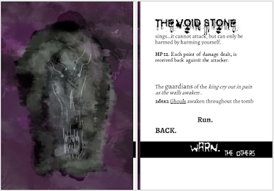
Let us start with the layout. Following the convention established in the rulebook, the module is a riot of colour splashes, arbitrary font selection, and scratchy artwork (some homemade, some publicly sourced). Yes, this is part of the design style. No, it does not make for good reading or reference, it is a massive waste of printer ink, and it is a way to skimp on the actual content while inflating the page count. Colour of the Void is not as bad here as other Mörk Borg offerings, but it is pretty bad all right. Some of it is meant to convey horror with its disintegrating texts, but, let’s be honest, this has been done a myriad times, it is a waste of space, and it does not in fact make the adventure better.
 |
| Where are your loops now, MORTAL?! |
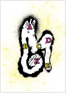
On the individual encounter level, things generally happen to the players. In a dark tunnel, “[t]he PC’s all lost one possession at random whilst stumbling through the tunnel [sic].” There are no stakes here. It is made clear that it happens whether the party has torches or not. Elsewhere, things happen based on die rolls – you can literally slip and die, as “The walls are thick with shards of sheer rock, vengeful in their nature.”, and that requires a DR12 agility check to avoiding 1d4 damage, ignoring armour. Player input is not really considered, or required in any of the encounters – they are passive observers who sometimes roll dice in combat or to see if they are harmed by a specific trap or effect.
 |
| This, my darling, is the Zybourne Clock |
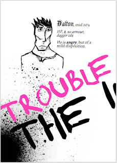
What else? There is of course a boss battle set up with a cutscene, and followed by a fight sequence (the undead king has an “obliteration beam” that sounds rather neat, although it basically only does 1d6+2 points. There is a neat illustration, and another cutscene: “Upon his demise, the King’s atoms are absorbed into the ether forever. His tomb begins to collapse. The void stone is weakened and vulnerable.” Of course, the rollercoaster ride doesn’t end here - ghouls are awakened, you escape the collapsing tomb, but the town is attacked by an UNDEAD VOID PLAGUED ARMY (I can’t reproduce the blood-dripping font on this blog, sorry), led by the girl they wanted to save. Here, there is a decent doom clock mechanic, where every action to rally the townsfolk, ask for more information, and so on, advances the clock as the horde of undead draws closer, and you can conduct your second boss battle.
 |
| Artpink |
No playtesters are credited in this publication.
Rating: * /
*****

Centre of mass and under the waterline. A fine review!
ReplyDeleteThirsty Sword Lesbians is truly the apex game of our day with Mork Borg a close second! Always appreciate your observations regarding the Artpink scene.
ReplyDeleteCan't wait to see the wave of quality adventures TSL will produce to save us all from eternal MB damnation. Praise the Ennies for bringing to our attention such magnificent examples of the future in adventure role playing games.
ReplyDeleteIf I want something with a yellow and black cover, I'll listen to Győzni Fogunk by Edda Művek, thanks. In fact, I'll do it right now!
ReplyDeleteNever mind the bollocks comes to my mind.
DeleteThis is your most revealing review yet as we now know your intention is self aggrandisement and not the discovery of what little excellence there is to be found.
ReplyDeleteThe Bitter Non-Gamer strikes you as he hastily declares victory. "I surely wounded him this time", he mutters as he scurries back to the crevices wherein he lurks.
DeleteKent leaps dancingly towards the foul rock-crack and with stones and muck plugs the evil within. Nevermore will the wicked stink-scribe Melan expose a sewer to sell his soaps hard by.
Delete"You mustn't criticize without offering a way forward or, preferably, lead by example! But you *also* cannot do a better job because then you are just trying to stoke your own ego and pad your pockets!" he criticized.
DeleteYou can throw cheap jokes at it all day long, but there _is_ a strong design principle behind MB, namely that of an end-of-the-world, existentialist dark fantasy, with about as much meat on it as your average OSR booklet ruleset, or even (gasp!) the Holy Writ of the LBBs, as evidenced by people who somehow were able to play long campaigns with this artsy chaff without any real substance (besides "the big evil black doom coming to consume the world" can't be called a rare trope in generic frps either). On the other hand, what's the rock-solid design philosophy of the original OD&D? That you can go whack monsters and win treasure with a simple set of rules, then go back to whack some more? In the beginning there wasn't much more than that, and hailing all the accumulated experience in game design nearly 50 years later as the infinite wisdom of the elders in the first place is a fallacy I guess.
ReplyDeleteI feel like you're praising Tesla for their Autopilot, while comparing it to the "trivial" work of inventing the wheel. In the letter case you're ignoring the historical context.
DeleteOD&D, despite its shabby appearance and poor editing (*), is built on an interlocking set of strong rules and procedures that outline a structurally sound, but ultimately open-ended exploration game that operates on multiple levels (mainly dungeon-crawling and wilderness exploration in the original edition, with hints of domain management and nautical/aerial combat). At its core, it stands up very well as a "game" game, and has actual thought and a lot of practical polish behind it. Its makers were experienced people designing game rules, and doing a lot of playtesting. It is a tight design in an amateurish package - substance over style.
DeleteMörk Borg is built on a strong aesthetic, papered over with a haphazard collection of mechanics inherited from B/X D&D, and reassembled without any understanding of how they actually work. On the procedural level, it is a non-entity. It is all style and the very little substance it has comes from the eviscerated bits and pieces of B/X - good material, but degraded and disconnected.
This is something even storygamers could easily understand, but refuse to.
Unfortunately, Mörk Borg's failings are passed on to the modules written for it - if there are any above a very weak ***/***** level, I have yet to see them. Where is the great stuff that would please the Kent? It is not really happening because the books do not provide solid advice on making them, while even B/X - originally an intro game for kids 10 and up - does give a basic dungeon / wilderness development framework that will produce something decent if you learn to apply them.
The mörklings - whose doom is foretold in a great saga found at https://princeofnothingblogs.wordpress.com/2022/08/18/the-phoenix-arises/ - could have learned much honest craft from old-school gaming. But they didn't, and have thus been reduced to creative penury.
___________________
* For a more successful presentation of the same basic game framework, see the Empire of the Petal Throne rulebook - edited by someone with more experience in writing what are essentially instruction manuals. After subtracting the weirdo aesthetic, EPT is a slightly houseruled, but much more logically introduced OD&D - and it is easy to see how it shines.
That Zybourne Clock reference is a deep cut. But the resemblance to Johnny Five-Aces can't be denied.
ReplyDeleteJohnny is forever.
DeleteYou should record some sessions when you anticipate a good game. You don't have to publish anything, but you will have the raw material which can be edited so long as there is good *sound*, i.e. dialogue, conversation. The image, video, is only useful for projecting the voices this way and that, to distinguish character. And maps and illustrations can be added later. The key is to capture the voices.
ReplyDeleteI wish I had recordings of my games from c.1990. It wasn't conceivable back then but now it is too easy.
I had access to cheap tape recorders even in 1990 (not that it occurred to me that I should record our games).
Delete